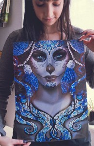
Never judge a book by its cover, they say. I say nonsense! I like pretty covers. When it came time to design the cover for Angel Falls, I wanted to do it right. My artistic skills are fairly minimal (as you will see shortly) so I had to commission an artist. There’s a lot of places to look out there on the web, but I knew the style I wanted, so I searched for similar artwork on DeviantArt until I found the artist who hit the mark perfectly.
Enter Bea Gonzalez! (no relation)
I wanted the cover to be reminiscent of stained glass portraits of saints, giving off a vibe of Hell, while elevating the main characters to iconic status. The artistic process is always a delicate balance, and I like to give artists as much free rein as possible, but time was of the essence here. I wanted her to know roughly what each character looked like, what they wore, and a bit about their personalities so that she could give their faces the right expression. Just like in playwriting, I think the most important part in this kind of collaboration is to tell the artist as much as you can about your vision without dictating how the finished piece of art will work. So, I designed a word document outlining how I saw the characters in my head (comparing them to actors/characters I knew and giving samples of clothing or colors I liked), and then used my astounding photoshop skills to create the following image.
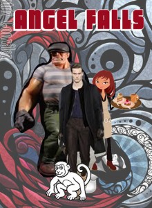
Breathtaking, yes? As you’re about to see, Bea is a miracle worker.
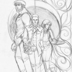
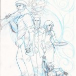
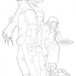
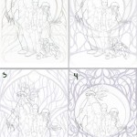
Here’s the progression of the images she sent me. Subtle adjustments were made to facial expressions and clothing, but she works FAST and blows my mind.
And the final cover image, suitable for framing!
Make sure you become her fan over HERE. Let her know I sent you!
